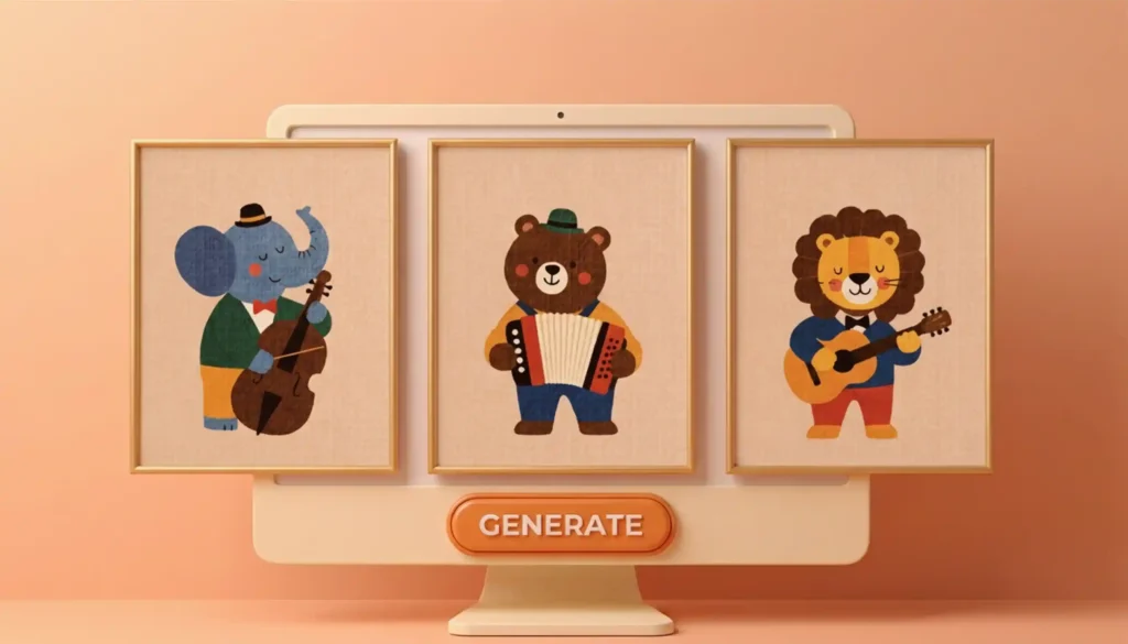
Right now, Etsy is obsessed with bright, whimsical nursery wall art. Earlier, you had to either spend countless hours hand-illustrating or burn cash to license someone else’s designs. But not anymore. Now, with design tools packing pro-level AI models, you can create stunning wall art that matches a professional illustrator’s work, all with a single click. Plus, they won’t break the bank. And the proof is right in front of you; just scroll through Etsy’s wall art section, and you’ll spot tons of shops selling AI designs and hitting consistent sales. But here’s the thing: most aspiring sellers don’t know how to prompt and use these design tools to create sellable wall art. That’s exactly why I put together this little guide, showing you how to create pro-level whimsical nursery wall art using the design tool Kittl.
Why Kittl for this tutorial
Getting sales on Etsy is basically a numbers game. That’s why you need to move fast when it comes to creating designs, and Kittl gives you that exact speed. Plus, it’s super beginner-friendly with a simple drag-and-drop editor; no steep learning curve as you get with a lot of other tools. On top of that, you get tons of design inspiration right inside the platform.
What actually sells in the nursery wall art niche
Before we jump into actually creating nursery wall art, let’s talk about what actually sells. Making random designs without any research is basically a shot in the dark. A few examples: Animals, vintage cars, and alphabet charts are all big hits with parents right now. Be sure to check out my guide on how to sell nursery wall art designs for the complete list and all the winning styles.
How to create whimsical illustrations in Kittl
1. Create a new file
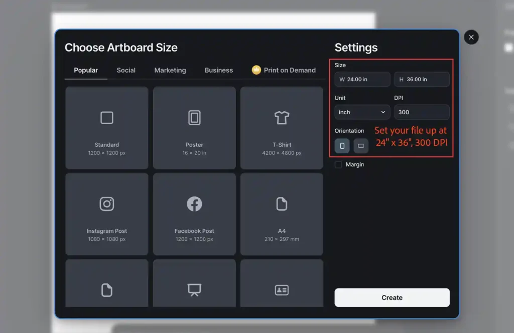
Head over to Kittl, hit Create in the left sidebar, and set up a 24” x 36″ file at 300 DPI. We’re going with this size because it is the most popular size people order for big wall art. A few pro tips: always design at the biggest size first because shrinking down to smaller sizes is easy, but scaling up breaks your pixels and makes everything look blurry. And always set your DPI at 300; it’s non-negotiable if you want crisp, print-ready quality.
2. Prompt the Image Generator
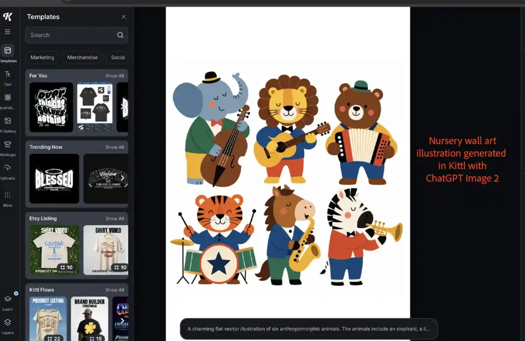
The logic behind AI prompting is pretty simple: generic prompts get you generic, obviously-AI-looking designs, while specific prompts get you high-end results. When prompting, think like a professional artist if you want a professional illustration. Check out the screenshot below; this is what happens when you enter a high-quality, specific prompt. The animal nursery illustration that came out doesn’t look AI-generated at all; instead, it looks like something straight out of a professional illustrator’s portfolio.
The Prompt
Here’s the exact prompt I used to get this illustration:
A charming flat vector illustration of six anthropomorphic animals. The animals include an elephant, a lion, a bear, a tiger, a horse, and a zebra, each playing a musical instrument. The lion is playing a guitar, the bear is playing an accordion, the tiger is playing drums, the horse is playing saxophone, and the zebra is playing trumpet. Minimal geometric shapes, rounded forms, simple facial expressions, no outlines, bold solid colors, playful composition, children’s picture book aesthetic, Scandinavian-inspired graphic design, paper-cut style, clean vector artwork, white background, symmetrical layout, whimsical and friendly, modern editorial illustration, high contrast, no gradients, crisp edges.
As you can see, this is a great example of a high-quality prompt; it covers all important things:
- Animals’ style: Anthropomorphic
- Animals’ actions
- Art style: Geometric shapes, simple, Scandinavian-inspired, paper-cut style, whimsical.
- Illustration style: No outlines, children’s book style, clean vector artwork
- Color palette: Bold solid colors
Quick Note: I completely forgot to specify which instrument the elephant was supposed to be playing in my AI prompt. ChatGPT happily filled in the blanks and handed it a full-sized cello. Honestly, I’m not mad about it except that it missed the bow entirely. No worries, though; I’ll just drop the stick in later myself in Kittl. It’s also a great way to learn how to add those little details AI generators tend to skip.
3. Isolate the animals
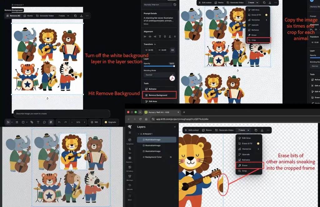
So right now, what you’ve got is just one big image with all the animals mashed together. If you want to turn this into a proper gallery collection (or just mess around with the layout), you’ll need to split them up first. Here’s how: turn off the white background layer, then remove the background from the image. Duplicate the image six times (one for each animal), then crop each copy so only one animal is showing. If any bits of the other animals sneak into the cropped frame, just erase them out.
4. Upscale
AI-generated images are usually low-res, so they can get pixelated when printed on a big canvas like the one we’re using in this tutorial. That’s why upscaling is a must. Luckily, Kittl has an upscale tool that can upgrade your images to print-ready quality without losing any sharpness.
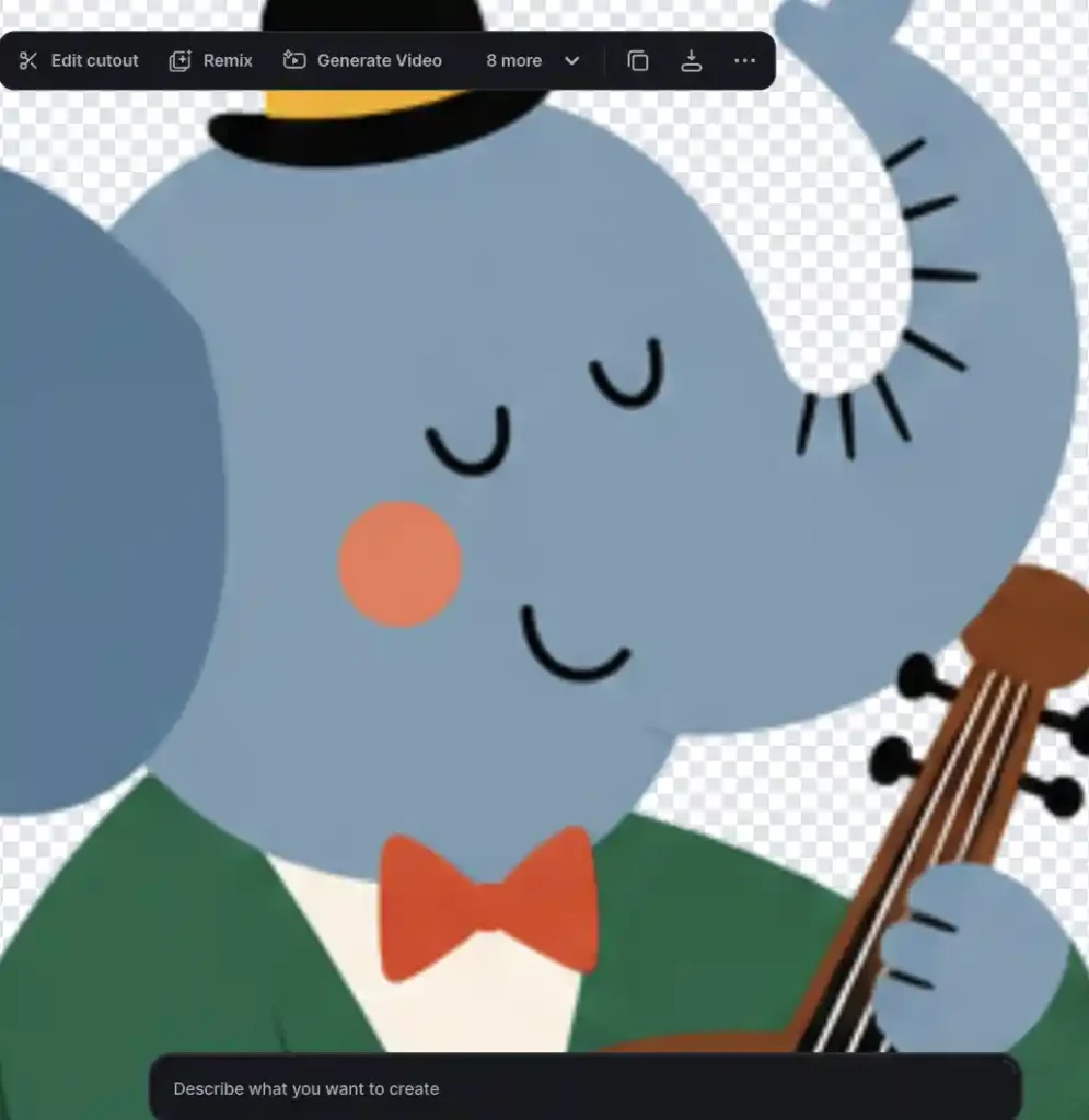
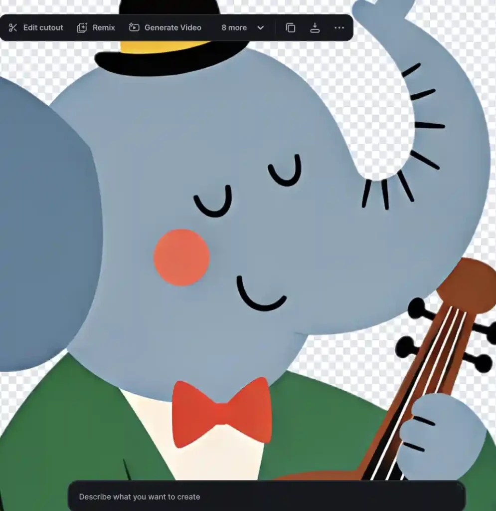
Check out the screenshot below showing a side-by-side comparison of the elephant’s image before and after upscaling. You can clearly see in the zoomed-in elephant’s image that the upscaled image is sharp and clear compared to a hazy, pixelated raw image.
Before Upscaling – Hazy and pixelated
After Upscaling – Clear and sharp
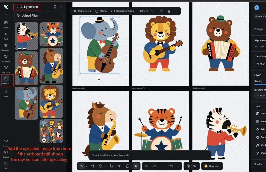
If you’re making gallery wall art, you can split the animals into separate artboards and then upscale each one. I set up separate artboards, dropped each isolated animal onto its own artboard, and upscaled all of them separately.
Tip: After upscaling, the artboard sometimes still displays the original raw (non-upscaled) image even though the upscale finished. Don’t re-run the upscale, check your Uploads folder first, since Kittl saves every upscaled result there automatically. Drag the upscaled version from Uploads onto the artboard to replace the raw image directly.
5. Fix little details
Like I mentioned earlier, AI image generators sometimes miss small details, like that missing bow in the elephant illustration. Maybe I’m being a little too fussy here; after all, it’s a playful nursery design, not some hyper-detailed illustration. But anyway, just to show you how to fix these little AI imperfections, I went ahead and added it in. I used Kittl’s rectangle tool to add the missing bow, then tilted and moved it so it looked like it was coming straight from the elephant’s hand.
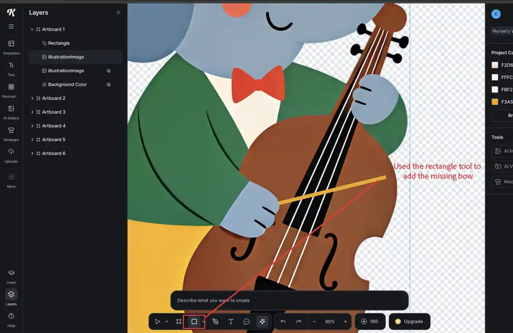
Note: background removal sometimes catches white illustration elements too — here’s how to patch that in 30 seconds
6. Add a background color
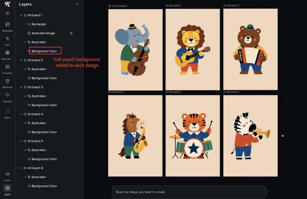
Soft, neutral colors like cream, beige, or peach work really well as a backdrop for bold, colorful graphics. Check out the screenshot below, I went with a soft peach background, and it really made my nursery wall art pop. Plus, this color is totally print-friendly too.
7. Add textures to make it unique
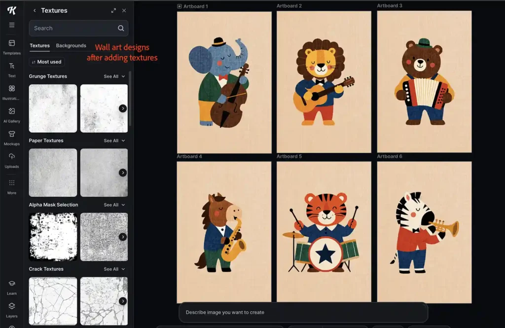
The secret sauce to high-end wall art is textures. The good news is Kittl’s got a huge library of textures you can drop right into your designs. Check out the screenshot below; I added a fabric texture to my designs really pop. Just add texture, stretch it to fit the whole canvas, set the mode to ‘overlay’, and slide down the opacity to softent the effect.
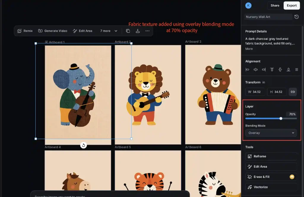
And here’s the final result after adding texture to each design: